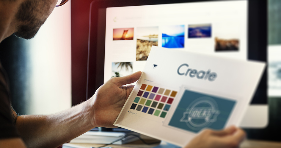
If beauty is in the eye of the beholder, then a company’s image and sign of excellence must be in its logo. This is why it is so important to get the logo just right according to your company’s needs and its positioning in the market. Here are a few tips on how to make sure your logo does most of your branding for you.
1. What is your competition doing? – Research the market, see what other companies in the same field are doing, and find the common thread between all the successful ones. Also know your target market, look into what they are doing, how they act and what catches their eye. Try to differentiate your logo from those of your competitors and make sure you stand out for all the right reasons.
2. Select a typeface that works – when selecting a typeface for your logo keep in minds trends but don’t let that lead the way. If the trends are subtle enough to support a certain typeface go with it, but don’t go overboard, most of the times more is less. Think of your product, who will buy it and how will the typeface you choose make them reach out their hand to buy from your company.
3. Give it a personal touch – avoid using a standard typeface, keep that as your foundation and work on that. Also, consider colour, images, shading, as all these elements will build a brand’s personality. You could tweak letters, go for a certain style that fits your profile and add unique, bold underlined statements in your logo that tell consumers that you know your own brand and you are here to stay.
4. Incorporate illustration – when talking about illustrated typeface we only have to look at the giant Coca Cola to see how thinking outside the box and making letters look more like an image can really set a brand above the rest. Using illustrated typeface can be a very powerful tool when it comes to building brand image and making your company a brand leader.
5. Colour can trigger moods, go for the uplifting one – we can use colours in our logos because they are aesthetically pleasing or because we want the colour to draw in attention. But when it comes to the colours you choose to be associated with your logo, you have to look at the psychological association to colours. For example, colours like red and yellow are the colours that make us want to spring into action, while earthlier colours like blue and green are relaxing. Know these facts and think how these colours affect consumers on an emotional level and then link the emotion that you want them to feel with your product and there you have it, a logo whose colours does half the work for you.

